CASE STUDY · HAECO · WITH MCKINSEY & COMPANY
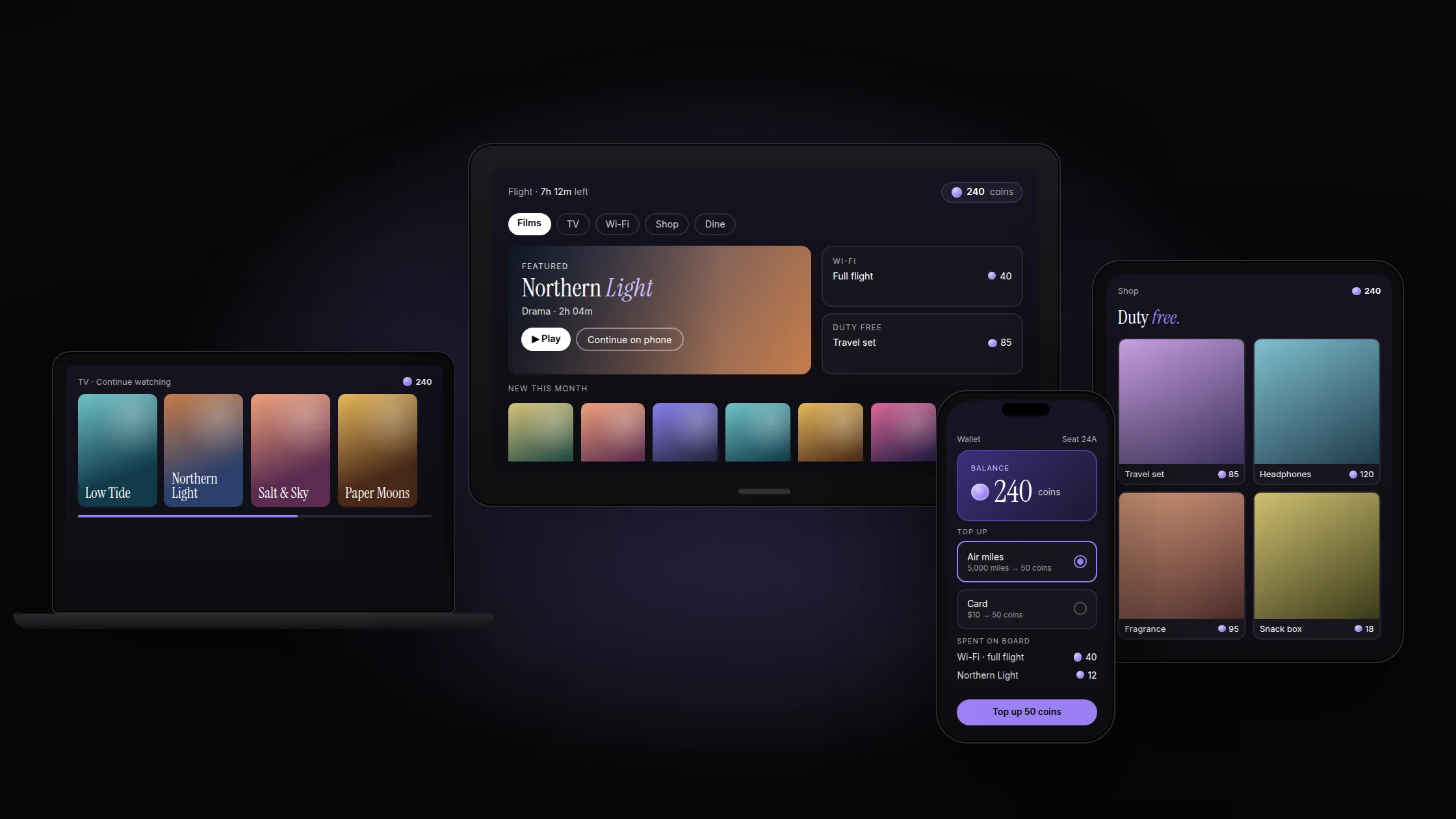
Due to NDA, the images on this page are illustrations to explain the idea, not the final product.
ROLE
UX designer, with the McKinsey team
COMPANY
HAECO, with McKinsey & Company
TIMELINE
5 months
FOCUS
Multi-device experience, in-flight payments, interaction design
screens, one experience: seatback, tablet, phone and laptop
wallet for every purchase on board
airlines flying it today: Etihad and Qatar Airways
from brief to final design
THE PROBLEM
Outdated systems
Old logic made simple things, like finding a film or buying Wi-Fi, slow and confusing.
One screen only
The experience lived on the seatback while passengers carried phones, tablets and laptops.
Hard to pay
Each service had its own payment step, and air miles couldn’t be spent on board.
RESEARCH
The McKinsey consultants led the research. I worked from their findings as design and product partner, alongside published industry data. Three findings shaped the product.
Passengers bring their own screens
OBSERVATION
In SITA’s survey of more than 9,000 passengers, 46% watched films only on their own devices, and 65% wanted inflight entertainment on them.
DESIGN IMPLICATION
One system for seatback, tablet, phone and laptop, and it should feel the same on each.
Paying is the friction
OBSERVATION
Nearly one in five passengers say payment friction stops them buying on board, and every service had its own way to pay.
DESIGN IMPLICATION
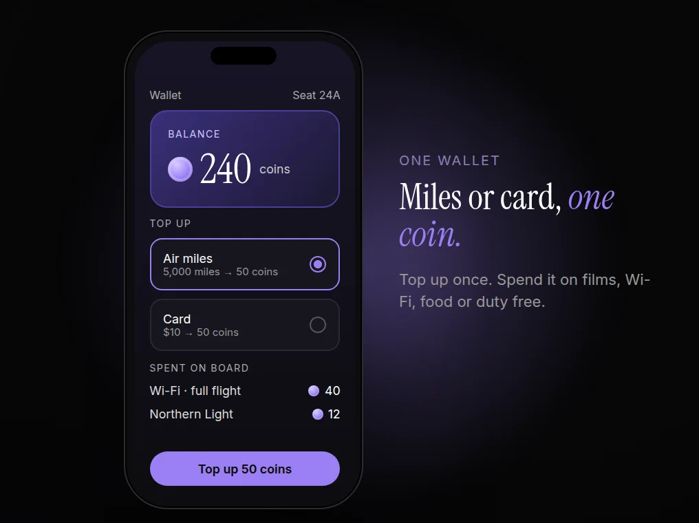
A single in-flight coin, bought with air miles or a card, pays for everything.
Miles sit unused
OBSERVATION
In some loyalty programmes only around 8% of miles are ever redeemed. Most people fly with a balance they never touch.
DESIGN IMPLICATION
Let miles buy coins, and turn unspent coins back into miles, so topping up feels low risk.
HOW IT WORKS
01
Same everywhere
One layout logic across four screen sizes, so nothing needs relearning when you switch devices.
02
Pay once, use anywhere
Top up coins once and spend them on films, Wi-Fi, food or duty free.
03
Nothing is lost
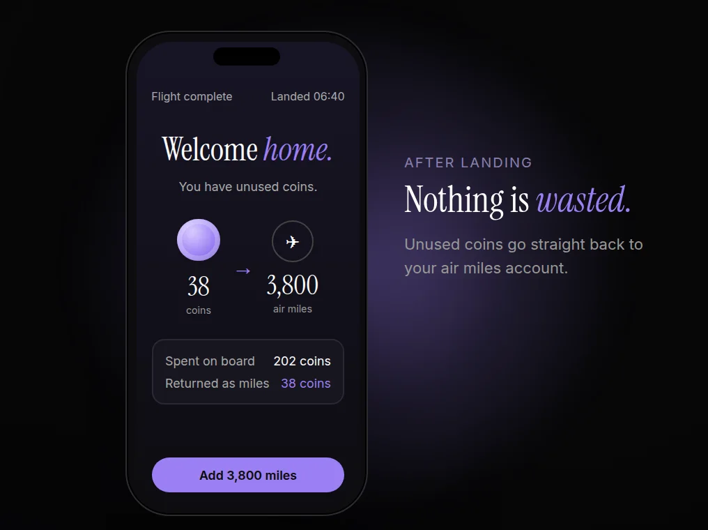
Coins you don’t use go back to your air miles account.
THE DESIGN
WHAT IT DOES
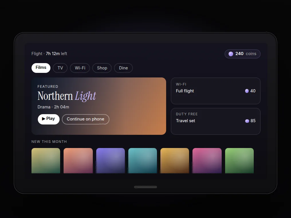
Films, shows, Wi-Fi and shopping in one catalogue, on seatback, tablet, phone or laptop.
WHY IT’S DESIGNED THIS WAY
Passengers pick the screen. The system adapts, so the experience doesn’t depend on the seat.
WHAT IT DOES
Top up with air miles or a card, then pay for anything on board in one tap.
WHY IT’S DESIGNED THIS WAY
One currency removes a payment step from every purchase and gives miles a real use in the air.
WHAT IT DOES
Unused coins convert back into air miles.
WHY IT’S DESIGNED THIS WAY
Knowing coins aren’t wasted makes people more willing to top up in the first place.
IMPACT
The system is still in use on Etihad and Qatar Airways flights today. It replaced single-screen, old logic with one experience that follows the passenger, and one wallet for everything on board.
WHAT I’D TELL ANOTHER DESIGNER
